I had a great idea, but not one so great that my foot fell off. Why not make a copy of the bracer in the British Museum?, I thought. It will be easy, I thought. I have the report with a nice clear drawing.
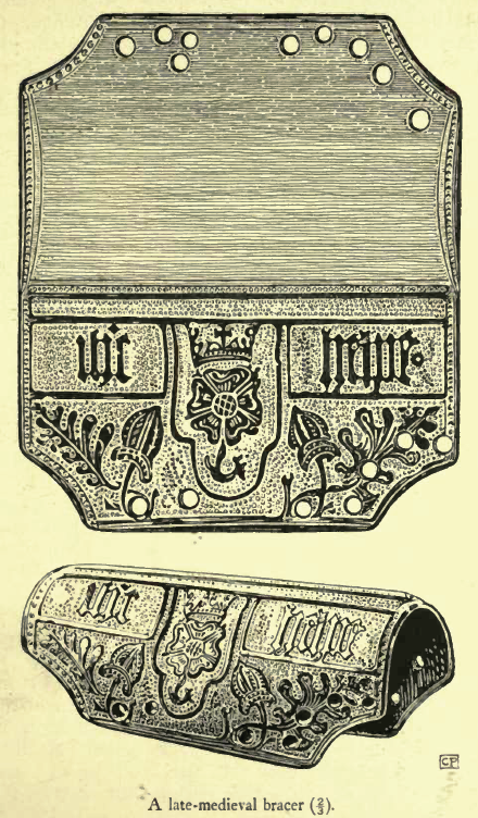
Dalton, Antiquities Journal, Volume 2, 1922 p209
It looks fine, right up to the point where you compare it with the photograph of the real thing…
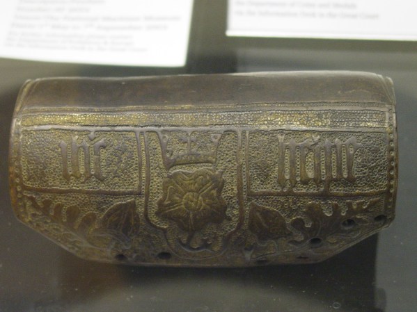
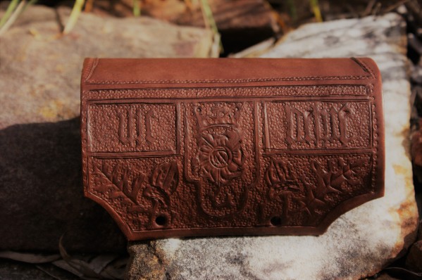
Bracer in the british Museum. My photo. That is an awful lot of gold.
When you try to use the published drawing, you find out there’s all these little fiddles like changing the size of the spots to make it work. The height of the decorated panel is okay but the two narrow ones above it are compressed. The lettering is all over the place as well and the sides of each panel don’t line up with each other in the same way they do on the original. Oh well, I’ll have to redraw it for the next one. The photo also shows how the gilding runs.
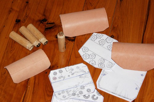
The process is simple enough. Transfer your design to the leather – because this one is to be gilt and painted, I just used plain old office carbon paper.
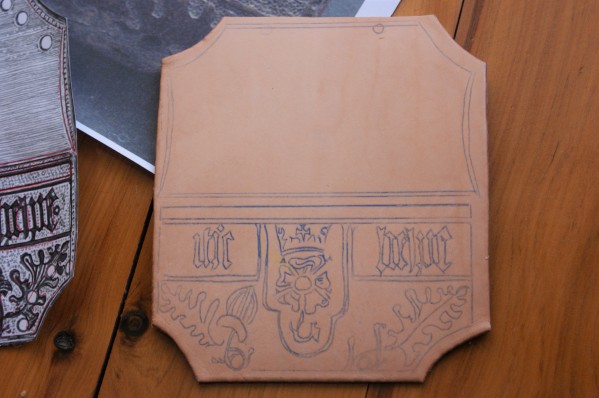
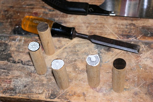
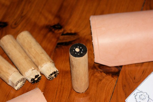
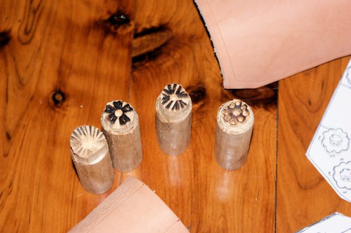
Straight off one of the problems becomes apparent. The pockles on the right have considerably more room than those on the left. I cut the outlines with a small straight blade as we’re predating swivel knives by several hundred years.
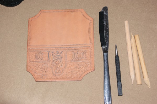
Empockelate appropriately with a 1.6mm nail punch, using kitchen utensils and home made punches as appropriate. Punch the holes for the strap, realising that they are too close to the edges and are the reason all the other holes were put in later for thong. Also realise that one hole in the drawing is too far to the right when compared to the other three. I tried swearing at this point, but it didn’t move the hole, so you can skip that if you like.
DieDye.
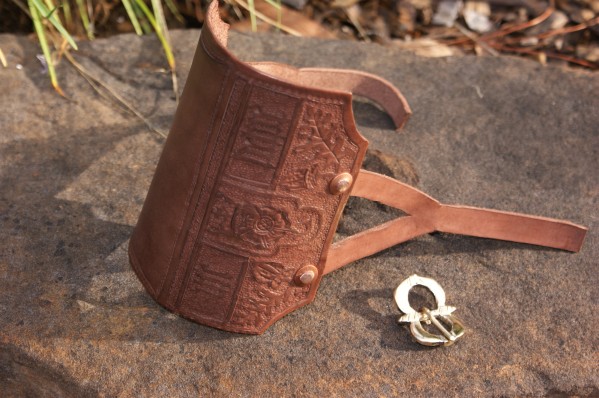
Enstrap and buckle. I either have to get faster at buckle making or give it up and buy them, I spend far too much time making the wretched things. I’ve gone with a copper alloy double oval loop buckle with moulded pin rests, making it date to between 1550 and 1650. [Whitehead, R., Buckles 1250-1800, Greenlight Publishing, Chelmsford 1996]
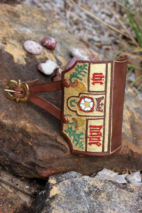
Painted bracer, it’s still a work in progress, I’ve since changed the colour of the crown.
Paint. The BM says some trace of pigment remains, having contacted them, it’s just a possible hint of red on the letters but they couldn’t tell me what the pigment was and if it was colour or bole (primer for the gilding). I’m going with colour, mainly from an ostentation point of view. Minium (red lead) substitute, rather than iron red in this case because it will be the same as on the rose. I also think the gilding is shell gold rather than leaf due to the way it sits down into the background rings and the narrow strips along the top and back would just be way too fiddly. There’s no evidence of the use of size under the gold in this case, either.
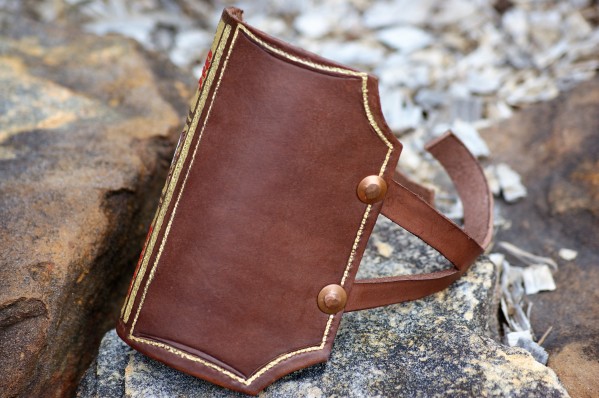
The painting on the other side is restricted to just lining.
I’m doing a Tudor rose, contemporary with the text, rather than a Yorkist white rose to match the tradition. It’s slipped and crowned (which may make it as late as Henry VIII or even Elizabeth) which didn’t happen with York white roses and I’m doing brown and ochre oak leaves and acorns, just because.
Yeah, it’s acrylic paint. Yes, I know I’ll have to apologise to Jesus, but I’ve been lead to understand that he’s fairly forgiving.
So I think I’ve finished it, it’s gone well as a fair copy of the reported illustration but I’m largely unsatisfied with it. I’ll have to have another go later.
While we’re on the subject, I need to vent a bit. The report begins on p208 of the Antiquities Journal with the sentence, “THE archer’s bracer illustrated in the fig. on p. 209 is of cuir bouilli, …” The BM repeat the assertion in their online catalogue.
I’m not sure what the fascination of antiquaries/archaeologists of this period is with cuir bouilli, they see it everywhere. Cuir bouilli, as the name implies, is a heat curing process that by its nature precludes tooling of the finished article. If you’re after more information on the subject, have a look at the late Marc Carlson’s Hardened Leather (Wayback Machine Internet Archive link) which also has some experiments on different methods.