
Quick Color Theory: Exploring the Color Wheel
Let’s examine the rules that dictate the language of color—color theory—and one of its most important tools, the color wheel.
Color in film is an artistic decision in its own right. From the colors of the costumes and set decoration to the camera’s filters and the tones emphasized in the grading process, the best films work from a common internal language of the colors they use.
Let’s take a look . . .
Basic Color Theory
All visual media relies on common understandings concerning how colors interact with one another. These rules are known as color theory.
Color theory is hundreds of years old, with its roots reaching back to none other than Sir Isaac Newton. These rules and applications have shifted over time and adapted to encompass new mediums, while also serving as a concrete reference point and planning any visual artwork.
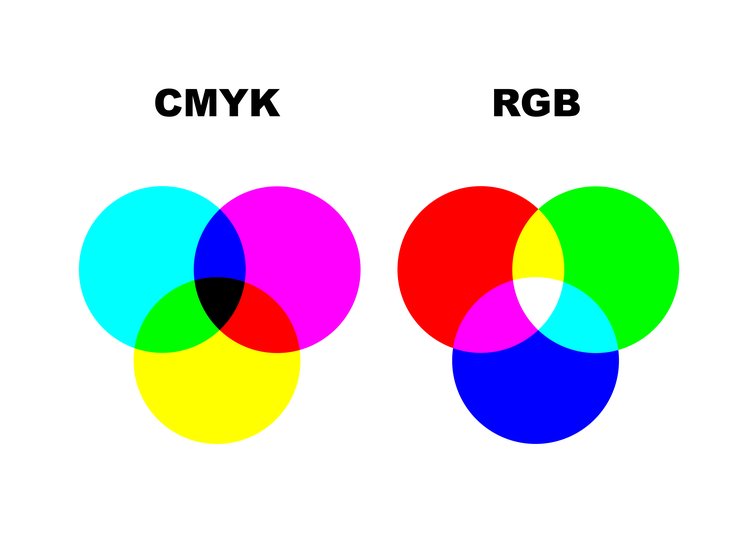
Color theory is subdivided into two main categories—additive and subtractive. Subtractive uses cyan, magenta, and yellow as its primary colors, which blend in the correct ratios to create red, yellow, and green as secondaries that combine together to create black. Subtractive color mixing is used in paints or dyes, amongst other media.
Additive color is used when mixing light to achieve color reproduction, such as in screens or cameras. As most readers likely know, additive color uses red, green, and blue primaries to get cyan, magenta, and yellow secondaries, which mix to create white light.
Let’s look at the tool that we’ve used for over 300 years to determine how a limited input set of colors can blend to reproduce nearly any hue in the visible spectrum of light.
The Color Wheel
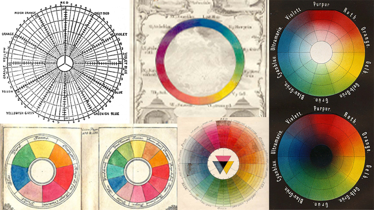
The most foundational tool in color work is the color wheel. Originally envisioned and laid out in 1704 by none other than Sir Isaac Newton, the color wheel lays out the relationships between colors.

The color wheel has undergone constant refinement and improvement over the three centuries since its adoption. Traditionally, the wheel is divided into seven to twelve sections, with the hues of visible light reproduced around its circumference.
More modern color wheels increase the number of shades and hues of reproducible color by factoring in the saturation and lightness of the color as it approaches the center of the circle.
At the outside of the wheel, the colors are at full saturation and approach black or white as they get nearer to the center, depending on whether the wheel represents an additive or subtractive color.
All characteristics of color can be reduced to three component values:
Value
Both value and luminance reference the brightness and contrast in the shot. In film and video applications, value is called luminance.
Chroma
Chroma is often referred to as saturation in video and photo tools and programs. It’s a measure of how intense the colors in the image are.
Hue
Hue refers to the general color family of measured color—red, yellow, green, cyan, blue, or magenta.
The color wheel is mainly used to identify the relationships between colors to allow for palettes and motifs to be built out to suit the need of the work.
Color Schemes
Many color schemes are available for visual artists to draw upon or implement into their works, but most of these schemes fall into one of five categories.
5 Color Scheme Categories
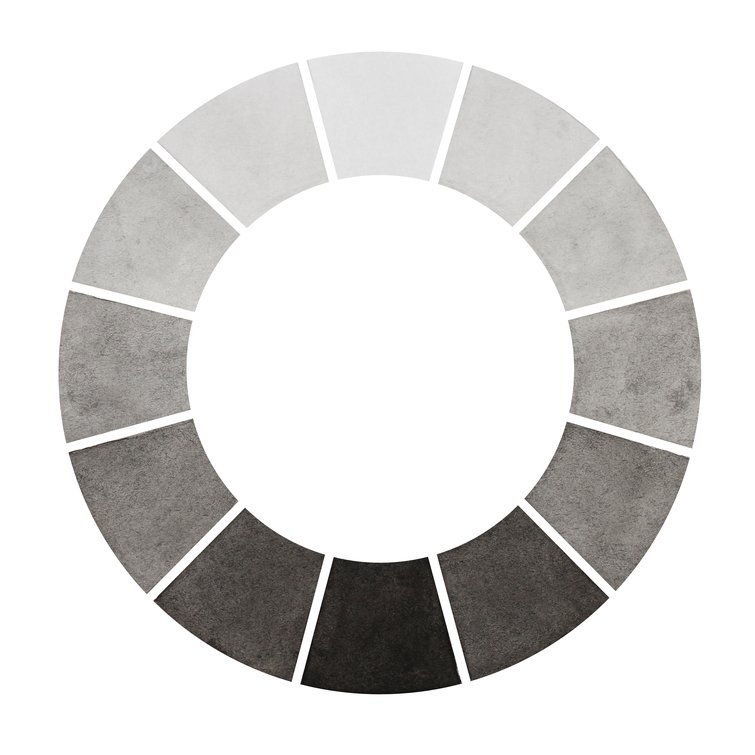
1. Monochromatic/Achromatic
Achromatic color schemes consist of colors without any chroma value. The only proper achromatic hues are black, white, and all grays—but neutral pastels, tans, and browns can also be referred to as achromatic, if they’re the only colors used in the piece.
Monochromatic schemes refer to all the tints, tones, and shades of a single hue on the color chart—essentially a slice of the color wheel pie.
Black and white footage is often mistakenly categorized as monochromatic when it’s achromatic.
2. Complementary
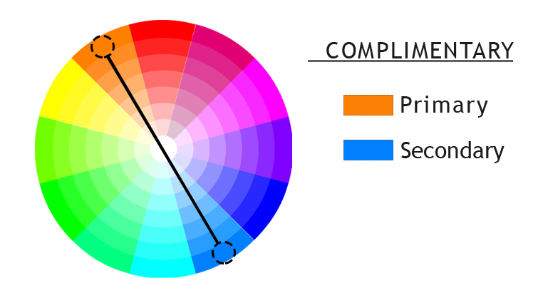
Isaac Newton established the complimentary color wheel when he demonstrated that using any colors that sit at opposing ends of the color wheel cancels or emphasizes both hues.
More than 300 years later, the complementary color scheme is still the most commonly used in all visual mediums due to its strong sense of chromatic contrast.
Complementary color schemes are built by selecting a hue on the color wheel, and then adding the one directly opposite it.
3. Analagous
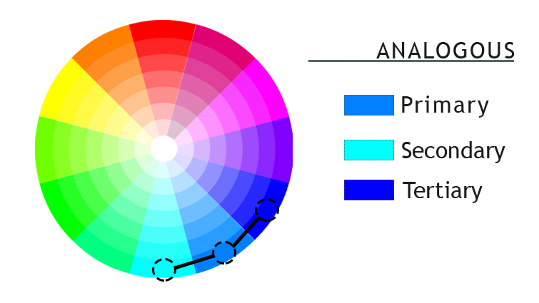
Analogous color schemes are composed of colors that sit adjacent to each other on the color wheel. They’re most commonly used with warm or cool colors to create a balanced, harmonious palette. Analogous schemes impart richness to the color palette used at the expense of chromatic contrast.
Analogous schemes can be modified slightly by replacing one of the adjacent colors with an accent color across the color wheel from the two analogous colors.
This scheme is referred to as accented analogous and is helpful to overcome the limited color contrast of similar standard schemes.
4. Triadic
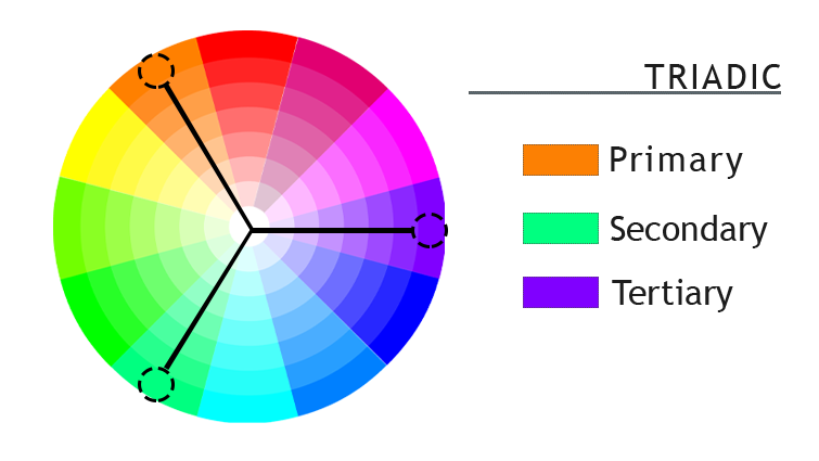
Triadic color schemes are most commonly used across all visual media. Triadic schemes combine three hues spaced (often evenly) across the color wheel.
Well-balanced triadic schemes impart balance and harmony to images, while maintaining healthy color contrast.
5. Tetradic
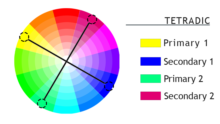
Tetradic schemes are simply two pairs of complementary colors balanced appropriately. Unlike other schemes, one color in a tetradic scheme needs to be dominant or risk perceived color imbalance.
The colors used in tetradic schemes are traditionally laid out in either a square or rectangle shape on the color wheel. Rectangle schemes are best used when one of the colors used naturally dominates the others, whereas square schemes work better when the four colors are more naturally in balance.
Proper, planned use of color adds dimension, meaning, tone, and style to every shot of every scene. Next time you’re planning a shoot, remember to set some time aside to consider what color schemes will most effectively drive your film.
A few more filmmaking tips, tricks, and advice just for you:
- How to Shoot Interior Locations with Limited Lighting
- 4 Beginner Tips: How to Improve Sound on Your Next Video
- Cinematic Tips: Shooting 35mm with the Filmmakers of “Wake”
- Swan Song: 5 Tips for Building an Actor/Director Relationship
- Create Better Establishing Shots with These Photography Techniques
Cover image via mentalmind.