You Won’t Believe These Cover Designs to Philip K. Dick’s 1969 Classic Mind-Fuck Conspiracy Novel Ubik
Which one is your favourite?
Originally published in 1969 to confusion and excitement (“If you are subject to the screaming meemies, don’t read this book alone at night” the Luna Monthly reviewer beamed), Philip K. Dick’s Ubik instantly gained notoriety as a “mind-fuck” novel, and its street-cred has never quite faded.
“If anyone has a coherent summary that wraps up all the conflict in the novel, I’d love to hear it, but I suspect the task is impossible,” writes a reviewer for The Guardian’s Book Club. If you were hoping that Dick could shed some light on the whirling conspiracy plot that sees time fly backwards, entire cities disappear, and characters rapidly dry up and die, you would be mistaken.
“Did you know that Ubik is true,” Phil asked Rolling Stone journalist Paul Williams in 1975, explaining, “We’re in a sort of cave, like Plato said, and they’re showing us endless funky films? And now and then reality breaks through, from our friend who was here once and then died, but has turned back?”
Gah!
To look through book covers from around the world to Dick’s vast canon of paranoid fables, over-the-top camp adventures, and delightful parodies of consumer culture, is to marvel at how they have been refracted through different cultures—sometimes to hilarious effect!
So let’s take a look at (and rank, of course) the best foreign covers for Dick’s classic conspiracy novel Ubik.
1. Japan (2011)
Japan takes the award for the sexiest cover (of any book ever). Hayakawa Publishing Corporation’s third edition presents Ubik in crisp, two-tone contrast. There’s nothing like a spray-can of Ubik pointed directly at your face! The spray-can cover has a long history, yet this edition feels utterly new and the clean, black background gives the novel a futuristic, detective-noir feel. Inside, readers are treated to the work of the highly esteemed translator Hisashi Asakura (the pseudonym of Zenji Otani (1930–2010). Otani was majorly prolific during his lifetime and translated many English-language authors into Japanese, including the likes of Kurt Vonnegut, Fritz Leiber, and J. G. Ballard. A top contender for best cover. Well done.
2. Slovenia (1982)
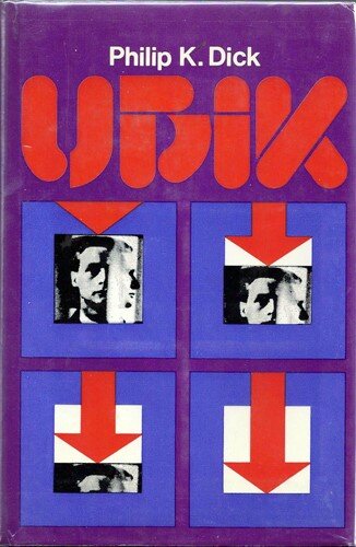
Slovenian publishing house Pomurska deliver a fine cover with their 1982 edition of Ubik. The colour scheme is wonderful and the font design alone is a work of art. Above all, the cover conveys and even augments the harrowing quality of the novel and Dick’s obsession with death. The four squares read as a condensed version of the story inside. Key characters Joe Chip and Glen Runciter are beset by a mysterious force which flings them backwards in time and drives them unceasingly towards death. The red arrow steadily erases the two men. Yet the four squares produce a circular logic, drawing the eye back up and allowing the story to repeat endlessly. The unusual inclusion of a documentary style photograph (with the afflicted humanity of this doomed man very apparent) generates a sense of actual human loss. It’s almost too much to bear! Ten out of ten.
3. FINLAND (1994)
Mind-fuck!
“Everyone knows,” the cultural critic Mark Fisher writes, “that the moment of vertigo in a Philip K. Dick novel occurs not when one level of reality has been exposed as fake, but when the second level, the supposedly more real level, turns out to be inauthentic too.”
The Finnish edition published in 1994 is a top contender for the best ‘mind-fuck’ image. This poor man’s head, which appears to have twisted fully around his neck and his eyes rolling up into his skull, captures the exact moment when reality starts to crumble and the reader leaves solid ground. The publisher combines a mood of giddy paranoia with a fun pastiche of consumer objects, wonderfully expressing the novel’s Pop Art sensibility. The up-beat, superficial images mirror the epigraphical adverts which frame each chapter:
Lift your arms and be all at once curvier! New extra-gentle Ubik bra and longline Ubik special bra mean, Lift your arms and be all at once curvier! Supplies firm, relaxing support to bosom all day long when fitted as directed.
4. ITALY (1995)
Italian publisher Fanucci deserve recognition for their bravura depiction of a giant disintegrating robot rampaging through a pixelated landscape (does not happen in novel). In the background, a planet seems to have shed a few layers. In the foreground are two spectator robots, whose robot body language seems unduly relaxed. The cover masterfully taps into the feeling of Joe Chip’s desperate journey across America. As his world regresses, disintegrates, and falls apart in fast-forward, Chip makes a bee-line for Des Moines, Iowa in pursuit of the Truth. The only known bulwark against regression and death is ‘Ubik’—the absolute in a spray-can. “He did not open it; instead, he reached for another. And then another. All had packs of cigarettes in them. And all crumbled into fragments…”
5. SWEDEN (1991)
The worst cover award goes to this Swedish edition from 1991 thanks to the awkward, lurching rigidity of the main figure and his inexplicable mustard yellow jacket and virtual reality headset (neither of which appear in the novel). The artist’s decision is especially ruinous because the novel contains some of the coolest outfits in the history of science fiction. Why not choose Joe Chip’s morning assemblage of “Gay pinstripe clown-style pajamas,” or his day-time get-up of a “sporty maroon wrapper, twinkle-toes turned-up shoes and a felt cap with a tassel”? Opportunity missed!
Okay, okay, the cover does nail the depiction of Joe’s love-interest. No, not the semi-dressed figure in the background, but the small, brown, dessicated, almost mummified corpse in the foreground. That’s Wendy Wright, who Joe discovers inside a hotel closet halfway through the novel. The emotional gravity of this moment is perfect captured as mustard man stares silently into Wendy’s tiny, heat-darkened face.
6. BULGARIA (1999)
That ten-legged demon logo…
Can’t make the frug contest, Helen; stomach’s upset. I’ll fix you Ubik! Ubik drops you back into the thick of things fast. Taken as directed, Ubik speeds relief to head and stomach. Remember: Ubik is only seconds away. Avoid prolonged use.
This edition of Ubik re-imagines Joe Chip as a retired boomer living in the Eastern-bloc. It’s hard to know whether the designer read the novel (the only thing that smoulders in the text is femme fatale Patricia Conley) but it matters little. The expression on this hapless man’s face is exactly Joe Chip’s and the cover captures the feeling of ontological corrosion that makes the novel so terrifying and so much fun. I love the pint of dark beer and the packet of cigarettes on the table.
7. RUSSIA (1992)
A top contender for the best cover is the Russian edition from 1992 with its Russified depiction of protagonist Joe Chip—look at those high cheekbones! You have to understand that in the novel Joe is a slightly-overweight American everyman, plump even. The artist here has radically shrunk Chip and added feminine eyelashes, a spiky mowed lawn hairstyle, as well as majorly outsize eyebrows and ears. You could drive a car between his legs!
In the novel, the faces of coins continually change as time regresses with various characters faces taken form. The cover represents beautifully these coins raining down in front of Joe’s hard-to-decipher expression. Is he grimacing or smirking?
The 1960s-style calligraphy title perfectly completes this souvenir edition.
8. JAPAN (1994)
“I think all the secrets of the universe are in Ubik. If only we could find them.” — PKD
Ubik was released in Japanese by Hayakawa Publishing Corporation (the largest science fiction publisher in Japan) first in 1974, then 1994, and again in 2011. The dream-like, otherworldliness of this beautiful cover unmistakably places Dick within the surrealist tradition. The solitary figure is depicted sitting down, but without a chair. He seems caught between cosmic realms, as if waiting for something to happen. No doubt the novel is drawing on Dick’s concept of “half-life” (the novel’s primary novum or science fictional conceit) in which characters can be frozen in a bardo-like state between life and death, and float around waiting to be “revved into sentience.” In Japan, Dick was idolised as a New Wave master, along with other surrealism-inspired writers such as J.G. Ballard and Stanislaw Lem.
9. FRANCE (1989)
This Livre de Poche edition scores points for conveying the novel’s glam-rock wardrobe with this exquisite electric-yellow jacket, dip-dyed cheesecloth cravat, authentic lime-green bangle, and shoulder-length dyed-white hair.
“No wonder my stuff is popular in France,” Dick wrote in his diary. “The surrealist, the absurd.” Of all the countries in the world, Dick’s fiction was most loved in France and this 1989 cover of Ubik expresses the chemistry between Dick’s high-concept slapstick sensibility and French literary culture. His short stories began appearing in France as early as 1954, and the first translations of his novels by 1958. The love-affair was mutual: in an interview in France in 1977, Phil comments that the greatest influence on his writing was not the America pulps, but the French realists, (Stendhal, Balzac, Proust), the Russian novelists influenced by the French, people like Turgenev, and even French-influenced Japanese novelists.
10. GERMANY (1977)
“Snarling, Jory bit him. The great shovel teeth fastened into Joe’s right hand. They hung on as, meanwhile, Jory raised his head, lifting Joe’s hand with his jaw; Jory stared at him with unwinking eyes, snoring wetly as he tried to close his jaws.”
The German edition of Ubik published by Phantastische Bibliothek in 1977 hones in on the grotesque in Dick’s imagination and creates a truly horrifying nose-less monster covered in long hair. This is an edition that I do not want on my bookshelf. (Magenta? Yuk.) The awful liminal space that this creature inhabits between the human and the non-human is exacted through the pair of sculpted eyebrows set atop two humanoid eyes, finished off by a soft, rather feminine pair of lips. Gross! This creature seems to be bubbling up from the depths. More than anyone, it evokes the character of Jory Miller, the malevolent teenage antagonist who roams the world of half-life literally eating other characters.
11. U.S.A. (1969)
Let’s pause here and enjoy the first cover of Ubik to enter the world. This exquisite design (created by Peter Rauch) was published by Doubleday & Company in 1969. It is a real collector’s item and a signed copy of this edition would set you back $4,500 US dollars. What most readily comes to mind here is Dick’s connection to Andy Warhol, an artist whose fascination with the stuff of everyday consumer culture (Coke bottles, Campbell’s soup cans, food stamps, and dollar bills) is matched in Ubik by Dick’s detailed, loving attentiveness towards the materiality and branding of coffee, razors, deodorant, cigarettes, salad dressings, and newspapers. It seems highly likely that the first edition cover for Ubik pictured above was designed with Warhol’s aesthetics in mind. An exquisite achievement that was perhaps never topped.
If you enjoyed this article, you can browse the entire bibliography of Phillip K. Dick’s novels by country here: https://www.pkdickbooks.com/foreign.php.
Read more of Andy’s writing here in his latest collaboration with Dirt editor Rosalind Atkinson titled: “Dealing with Parents During Covid-19 Lockdown”.


